Our Corporate Identity "Inkspire Capi"
add


Name
Our Corporate Identity "Inkspire Capi"
The Concept: The Creative Spark
The agency's naming is a direct statement of our philosophy, born from the fusion of two concepts:
- Ink: Represents the materialization of ideas, the lifeblood of graphic design, art, and our professional printing branch.
- Inspire: The strategic engine that drives every marketing campaign, every line of code, and every photo shoot. We don't just offer services; we Inspire results.
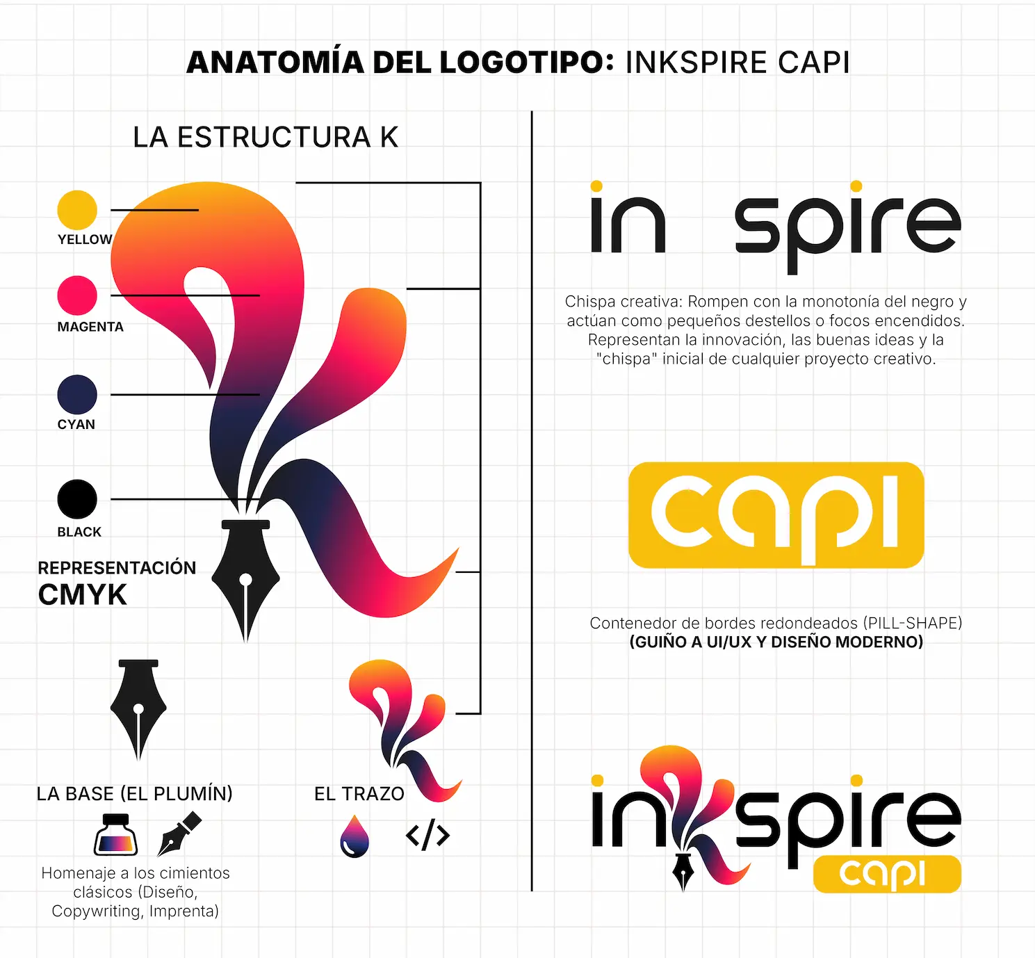
Logo Anatomy: Functional Minimalism
The imagotype design focused on the letter "K" as the focal point, achieving a perfect balance between corporate solidity and creative fluidity:
- The Base (The Nib): The lower part of the "K" integrates the silhouette of a fountain pen nib. It is a visual anchor that pays homage to the classic foundations of design, copywriting, and printing precision.
- The Fluid Stroke: Contrasting with the nib, the upper part of the "K" projects with organic curves. It simulates a moving ink drop or a free stroke. This visual fluidity represents our adaptability to digital environments, the speed of web development, and innovation.
- The "Capi" Seal: The word "Capi" is encapsulated in a rounded container (pill-shape). This element provides structured visual weight and makes a direct nod to usability (UI/UX) and modern web interface design.
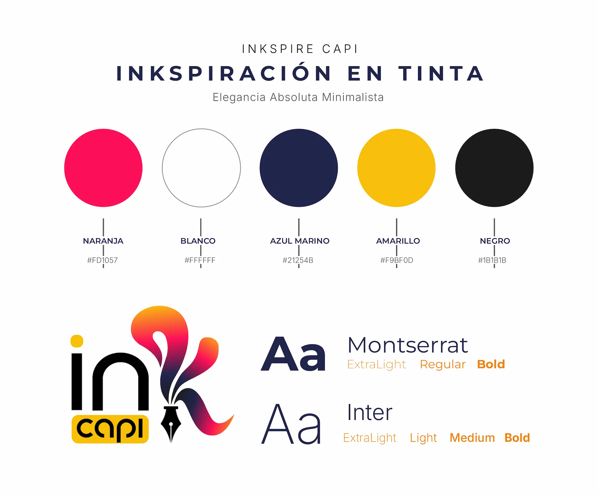
The Color Palette: A Nod to CMYK
The chromatic selection is one of the brand's most strategic elements. The vibrant gradient that brings the logo to life is no accident; it is a conceptual representation of the CMYK color model (Cyan, Magenta, Yellow, and Key/Black), the absolute standard for professional printing.
By mixing these tones in the "K" gradient, the logo visually communicates our mastery of printing art and color fidelity, integrating the following base codes:
- Vibrant Magenta (#FD1057): Injects energy, bold creativity, and action into our advertising campaigns.
- Deep Navy Blue (#21254B): Provides the authority, technological solidity, and trust necessary for software development and consulting.
- Golden Yellow (#F9BF0D): Symbolizes optimism, top quality, and the illumination of new ideas.
- Matte Black (#1B1B1B) and White (#FFFFFF): Contrast tones that guarantee sophistication, legibility, and a premium air across any platform.
Brand Symbolism: The "Capi" Philosophy
The name "Capi" and its association with the capybara encapsulate the DNA of our work culture. Far from being just a friendly badge, it represents unwavering corporate values:
- The King of Networking: It is the most sociable animal by nature. It symbolizes our ability to connect brands with their audiences organically and effectively.
- Composure and Reliability: In any situation, the capybara remains calm. It represents the security we provide to our clients: we solve complex problems without entering crisis mode, delivering projects on time and with precision.
- Total Adaptability: Experts in both land and water, they symbolize our versatility in mastering both physical media (printing, activations) and digital ecosystems (web, social media, ads).
Project Conclusion: The result is a responsive, timeless corporate identity with deep conceptual weight. Inkspire Capi enters the market not just with an aesthetic logo, but with a visual system that tells the story of an agency ready to take its clients' ideas to the next level.