Select a project
add
arrow_back
Select a project to learn more about the process and results.
No disponible

Name
Blanco's Bussy Bees Cleaning Service
Status
Design Concept / Development Inactive
Preview
Description
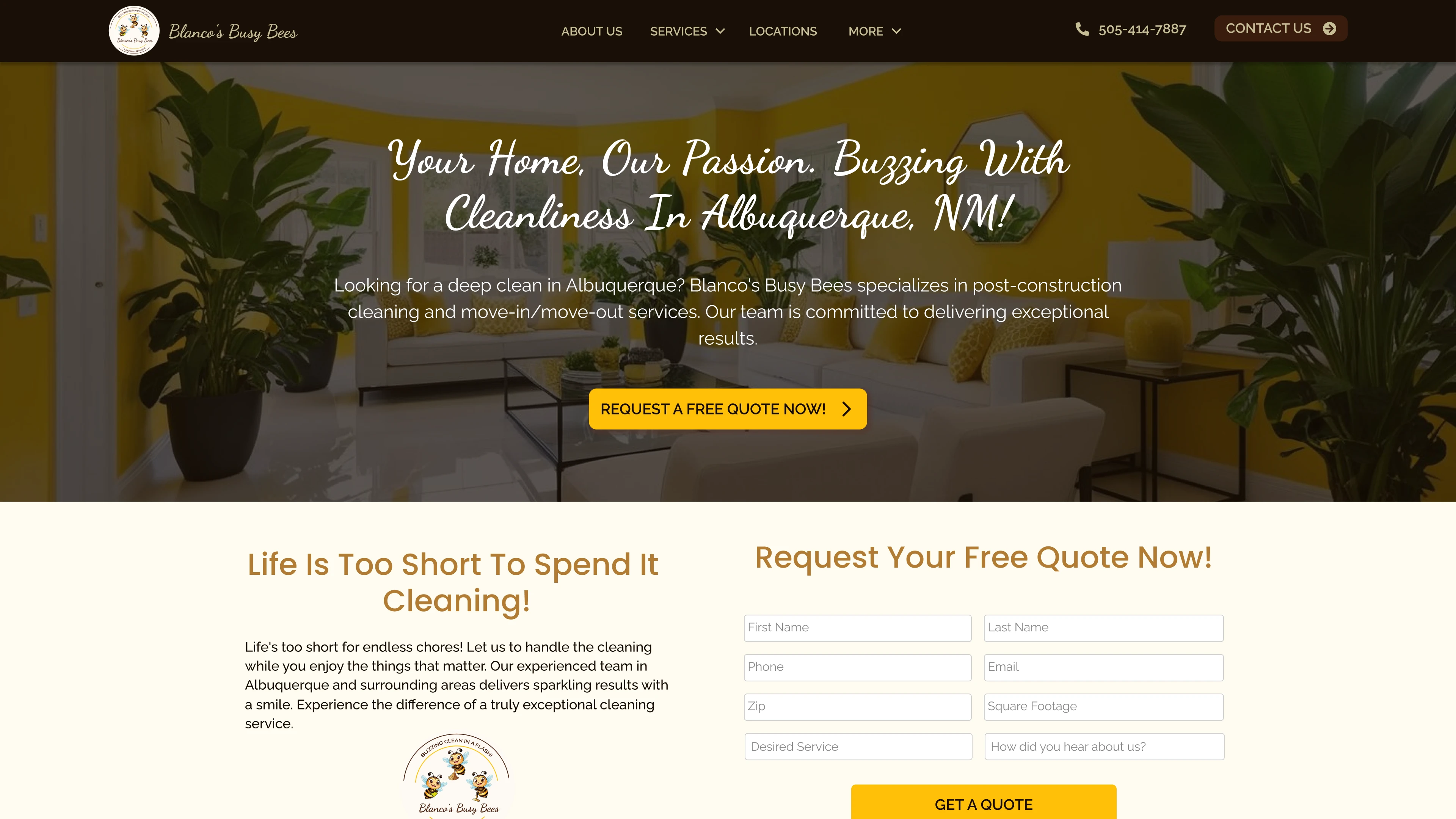
For Blanco's Busy Bees, the challenge was to transform a traditional cleaning service into a modern and trustworthy digital experience. We designed a conversion-focused landing page using a vibrant yet balanced color palette that evokes hygiene, energy, and professionalism.
The visual structure guides the user from the initial value proposition to integrated quote forms. We implemented strategic sections such as 'Our Happy Customers', 'Why Choose Us', and a visual service catalog that humanizes the brand and reduces friction in decision-making.
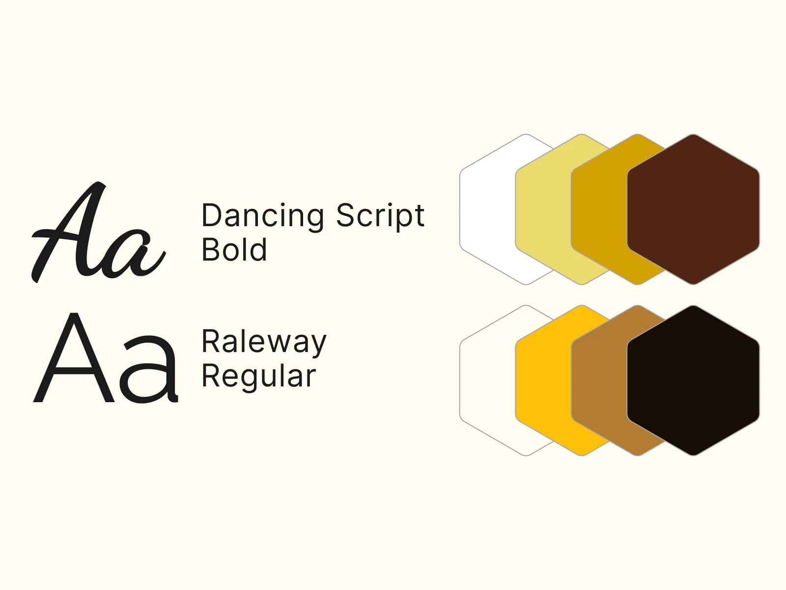
Although the project was paused during the design phase, the final delivery included a complete design system: typography optimized for fast reading, custom iconography for each cleaning type, and a fully responsive design adapted for mobile devices.
Style guide
Characteristics
- Lead generation-focused architecture.
- UI design with high-impact visual hierarchy.
- Custom iconography system for cleaning services.
- Flow optimization for appointment scheduling.
No disponible

Name
Our Contributor's Portfolio
Status
Development completed
Preview
Description
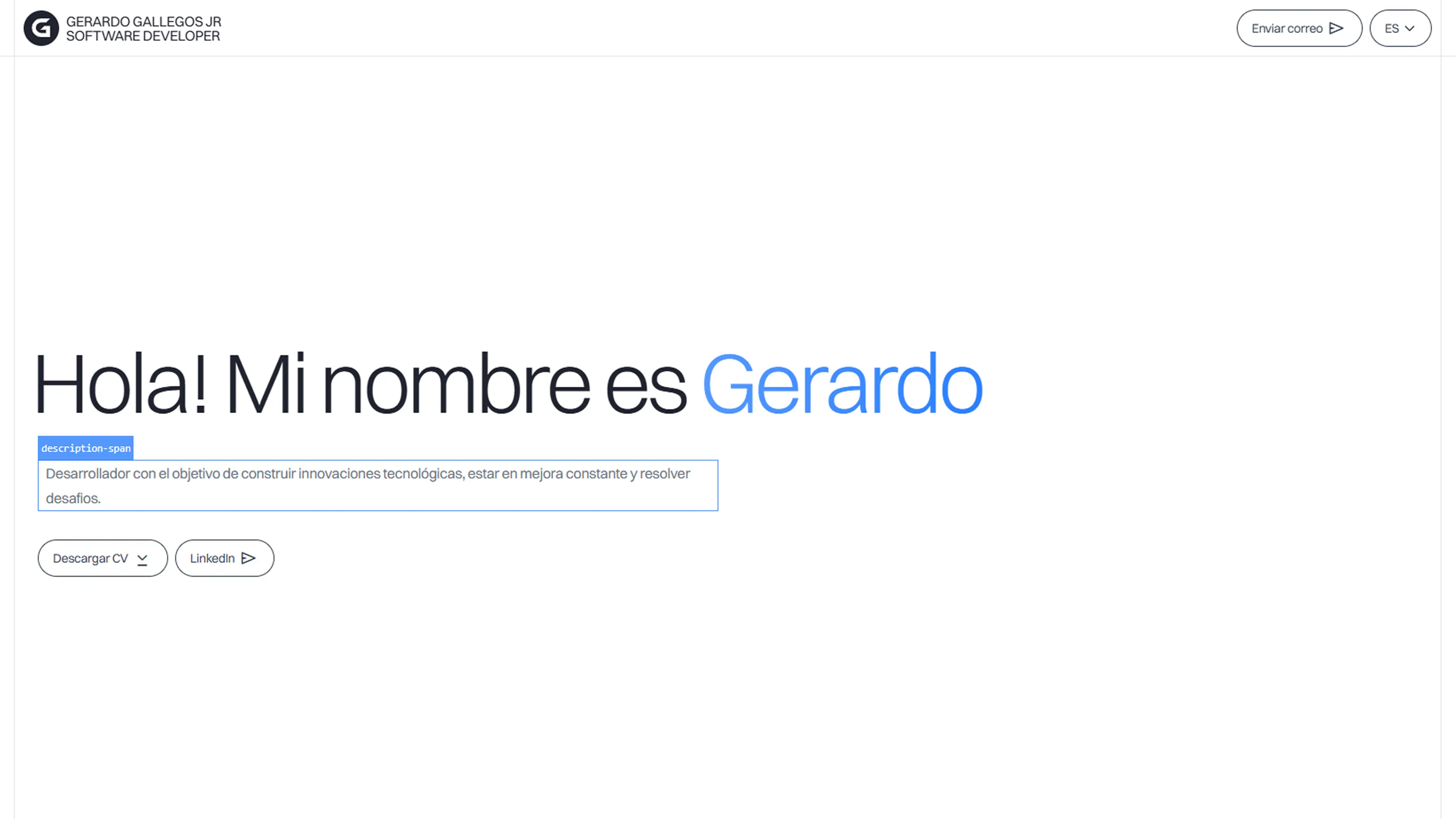
This space represents the professional identity of our team leader, designed with a 'Clean Tech Minimalism' approach. The central goal is to present his career path, key projects, and skills in a technical and detailed manner, offering direct access to his resume under a high-level aesthetic.
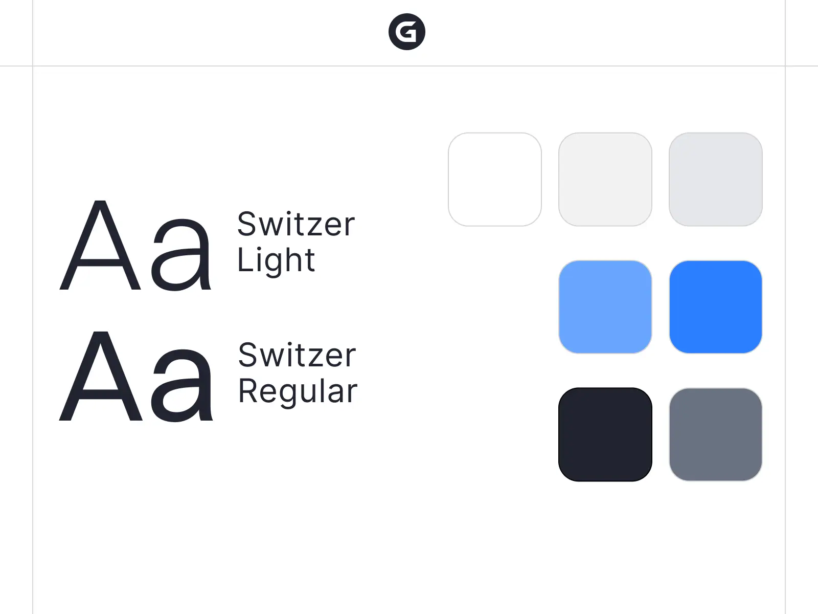
The art direction is based on an achromatic foundation of whites, grays, and blacks, using vivid blue as an accent to inject technological vitality. This chromatic choice is intentional; it seeks to project an image of vanguard, order, and sophistication in today's digital ecosystem.
Beyond the exhibition, this project functioned as an innovation lab for Inkspire. New frontiers in user experience were explored, implementing the latest version of our base framework, advanced particle systems, cursor micro-interactions, and high-performance animations that represent the next step in modern web development.
Style guide
arrow_forward
No disponible

Name
H7X Holdings Digital Ecosystem
Status
Development completed
Preview
Description
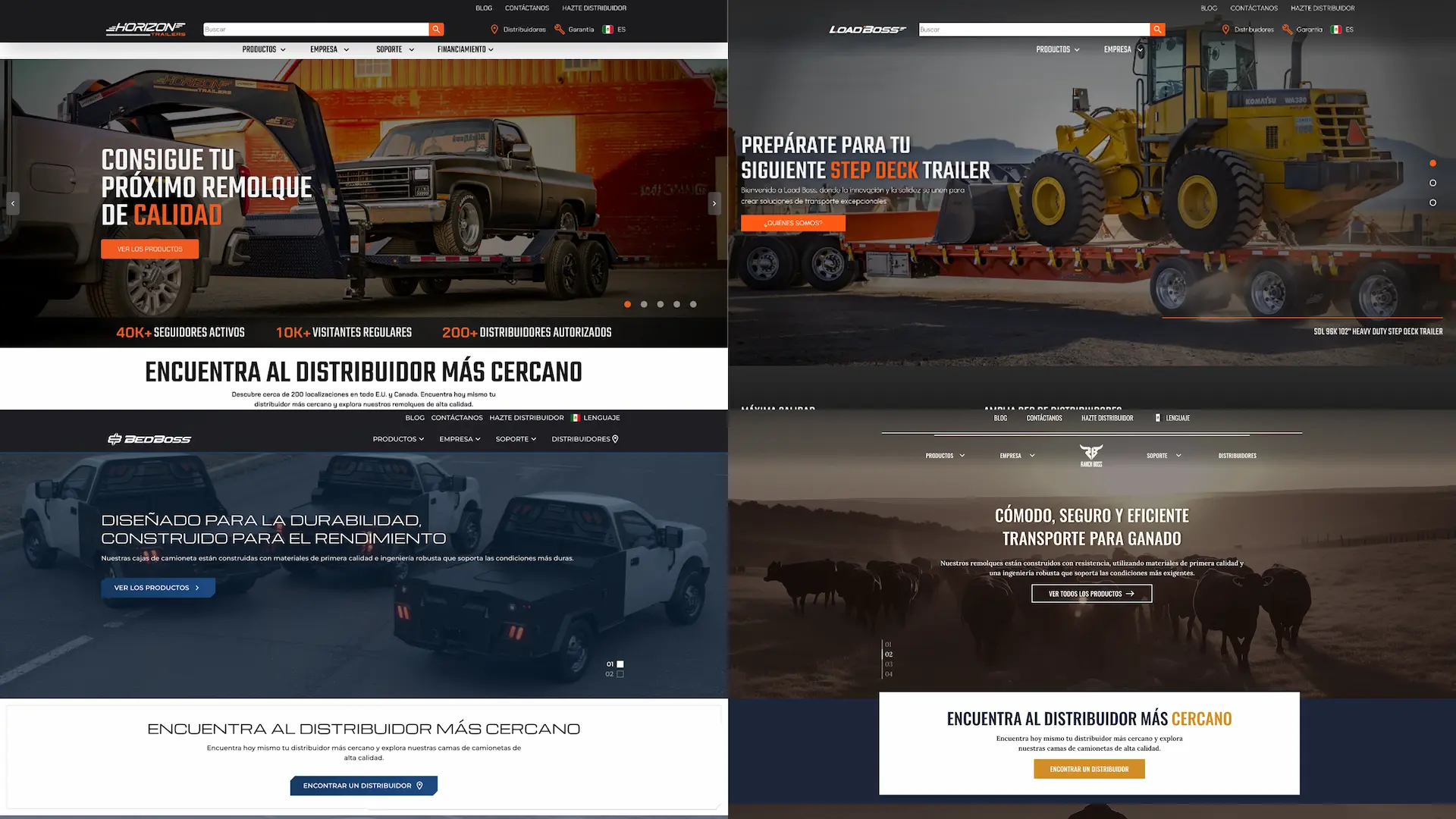
During his tenure at Horizon Trailers (H7X), our contributor served as lead developer and lead designer in the modernization of their digital ecosystem. The primary focus was to unify the brand's visual identity with a robust and scalable web architecture.
This work, carried out as an integral part of the company's development team, spanned from interface conceptualization in Figma to the technical implementation of its main commercial platforms, ensuring a consistent user experience throughout the product catalog.
The technical intervention included the deployment and optimization of the brand's official platforms, as well as the development of specialized sites for high-demand product lines, guaranteeing optimal load times and conversion-oriented intuitive navigation.
Characteristics
- Technical leadership and direction of the frontend development team.
- Interface design (UI) and user experience (UX) for the H7X ecosystem.
- Development and maintenance of Horizon Trailers and LoadBoss web platforms.
- Implementation of digital stores and catalogs for BedBoss and RanchBoss.
- Performance optimization and technical SEO for high-traffic sites.
No disponible

Name
Our Corporate Identity "Inkspire Capi"
The Concept: The Creative Spark
The agency's naming is a direct statement of our philosophy, born from the fusion of two concepts:
- Ink: Represents the materialization of ideas, the lifeblood of graphic design, art, and our professional printing branch.
- Inspire: The strategic engine that drives every marketing campaign, every line of code, and every photo shoot. We don't just offer services; we Inspire results.
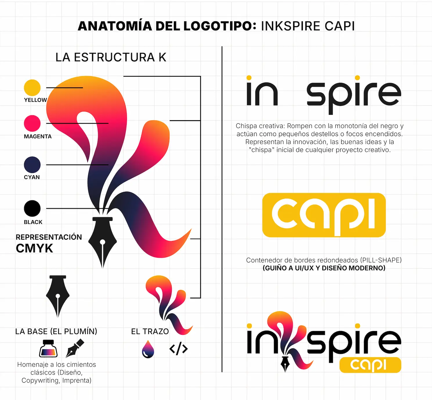
Logo Anatomy: Functional Minimalism
The imagotype design focused on the letter "K" as the focal point, achieving a perfect balance between corporate solidity and creative fluidity:
- The Base (The Nib): The lower part of the "K" integrates the silhouette of a fountain pen nib. It is a visual anchor that pays homage to the classic foundations of design, copywriting, and printing precision.
- The Fluid Stroke: Contrasting with the nib, the upper part of the "K" projects with organic curves. It simulates a moving ink drop or a free stroke. This visual fluidity represents our adaptability to digital environments, the speed of web development, and innovation.
- The "Capi" Seal: The word "Capi" is encapsulated in a rounded container (pill-shape). This element provides structured visual weight and makes a direct nod to usability (UI/UX) and modern web interface design.
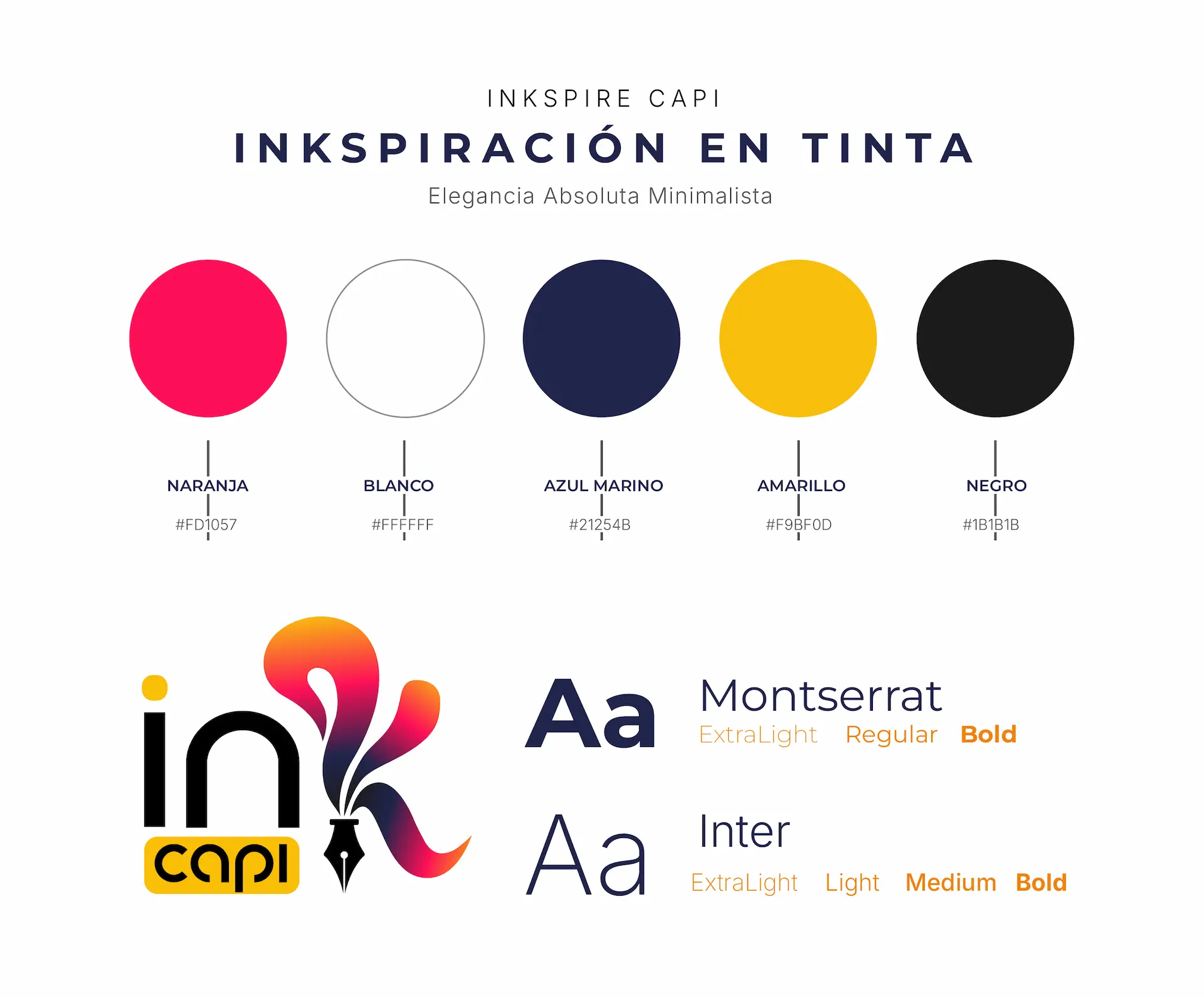
The Color Palette: A Nod to CMYK
The chromatic selection is one of the brand's most strategic elements. The vibrant gradient that brings the logo to life is no accident; it is a conceptual representation of the CMYK color model (Cyan, Magenta, Yellow, and Key/Black), the absolute standard for professional printing.
By mixing these tones in the "K" gradient, the logo visually communicates our mastery of printing art and color fidelity, integrating the following base codes:
- Vibrant Magenta (#FD1057): Injects energy, bold creativity, and action into our advertising campaigns.
- Deep Navy Blue (#21254B): Provides the authority, technological solidity, and trust necessary for software development and consulting.
- Golden Yellow (#F9BF0D): Symbolizes optimism, top quality, and the illumination of new ideas.
- Matte Black (#1B1B1B) and White (#FFFFFF): Contrast tones that guarantee sophistication, legibility, and a premium air across any platform.
Brand Symbolism: The "Capi" Philosophy
The name "Capi" and its association with the capybara encapsulate the DNA of our work culture. Far from being just a friendly badge, it represents unwavering corporate values:
- The King of Networking: It is the most sociable animal by nature. It symbolizes our ability to connect brands with their audiences organically and effectively.
- Composure and Reliability: In any situation, the capybara remains calm. It represents the security we provide to our clients: we solve complex problems without entering crisis mode, delivering projects on time and with precision.
- Total Adaptability: Experts in both land and water, they symbolize our versatility in mastering both physical media (printing, activations) and digital ecosystems (web, social media, ads).
Project Conclusion: The result is a responsive, timeless corporate identity with deep conceptual weight. Inkspire Capi enters the market not just with an aesthetic logo, but with a visual system that tells the story of an agency ready to take its clients' ideas to the next level.
Our History
Inkspire Studio was born with a clear mission: to prove that art and strategy are not separate paths. What started as a small design space evolved into a comprehensive creative hub where we fuse marketing, web technology, and physical production. Today, we help businesses of all sizes transform their visual identity into a real competitive advantage, connecting every idea with a tangible impact on the world.
Learn more arrow_forward